Just some notes about the book “Storytelling with Data”
Notes
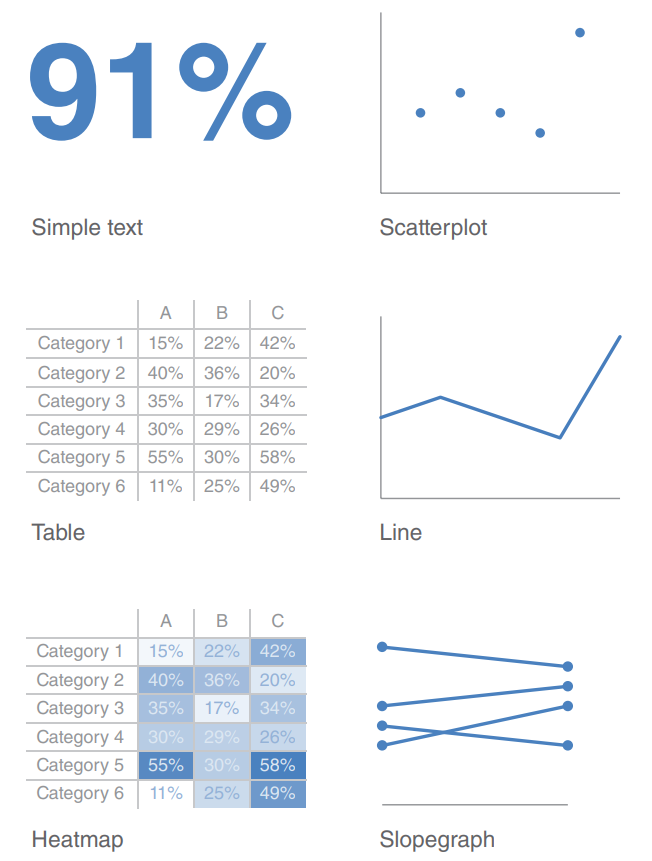
Effective visual
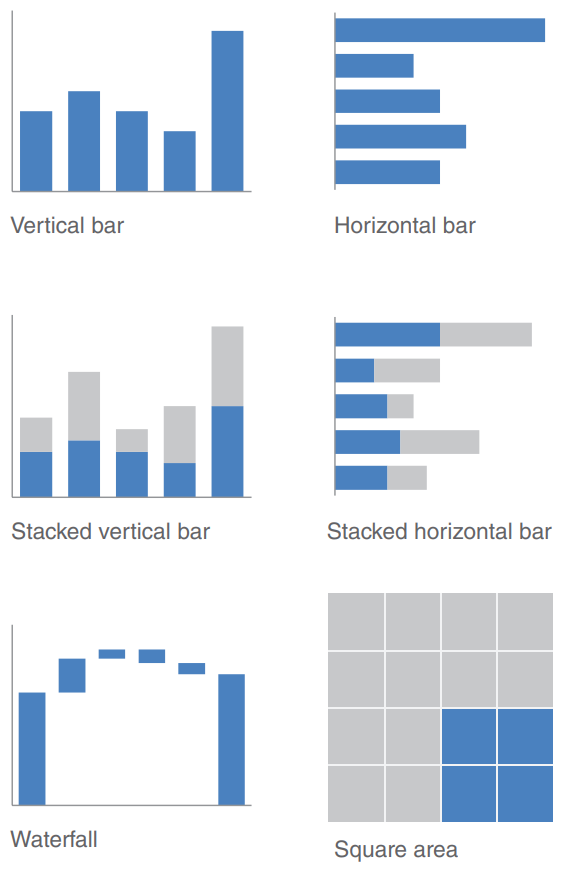
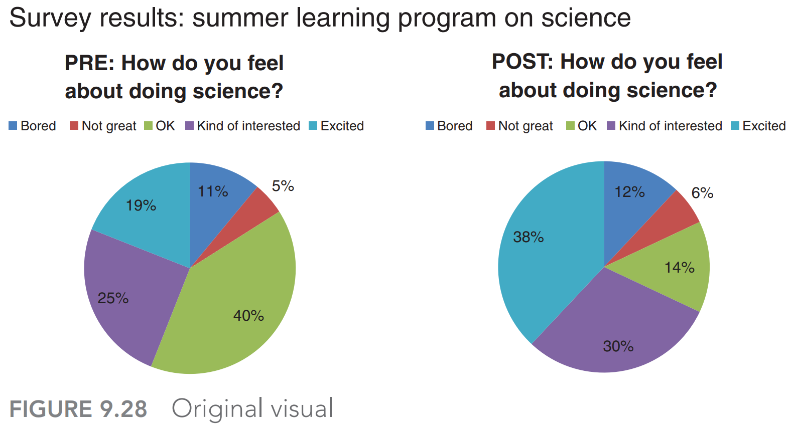
Never use 3D, pie chart
Only add data with a thoughtful and specific purpose in mind
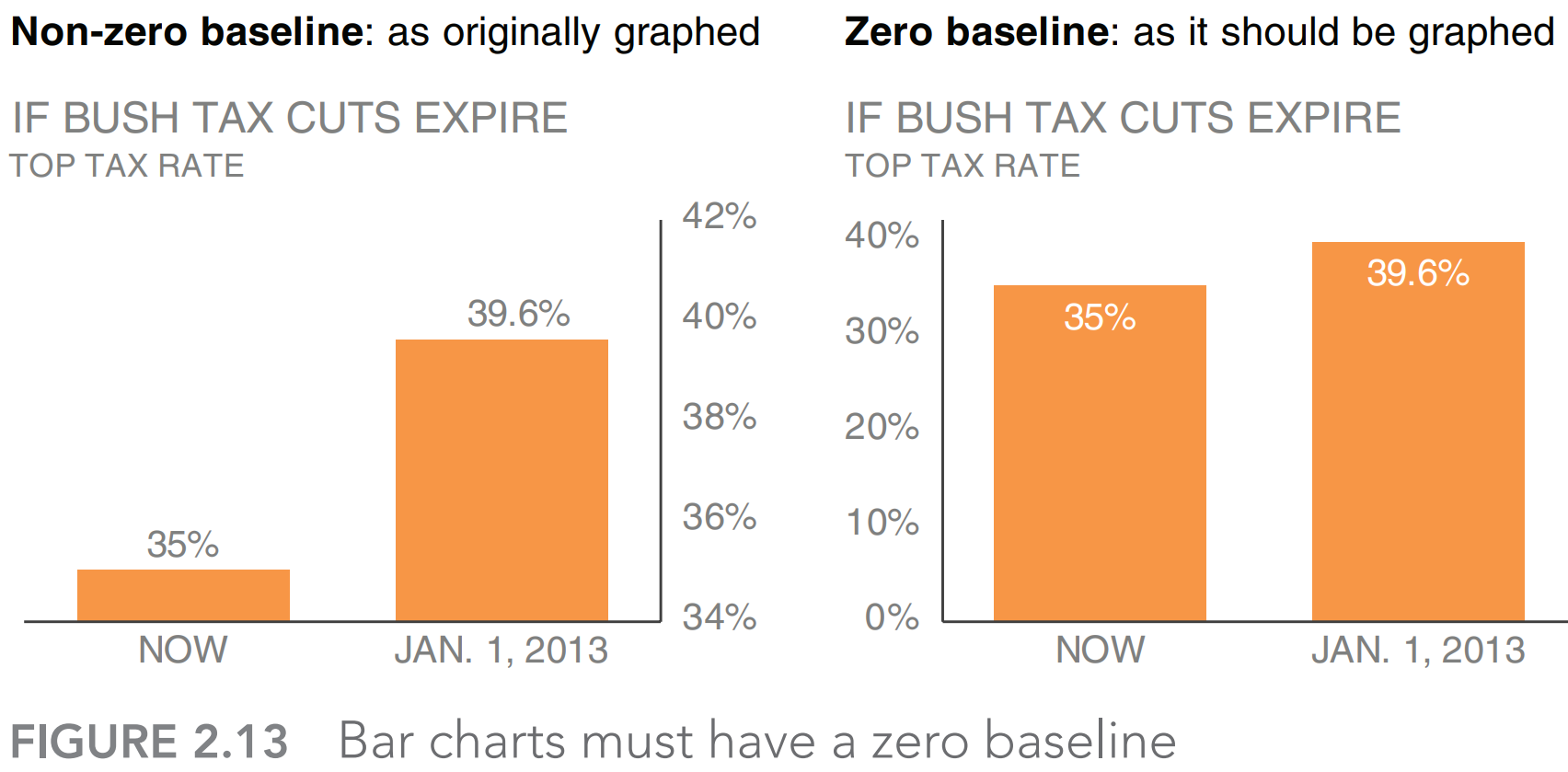
Zero baseline
Remove clutter
- Remove chart border
- Remove gridlines
- Remove data markers: use them on purpose and with a purpose
- Clean up axis labels
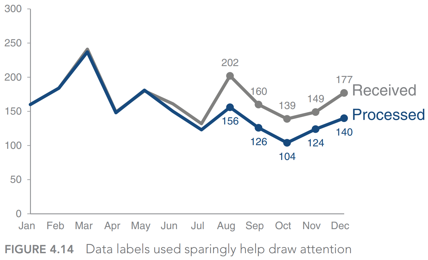
- Label data directly
- Leverage consistent color
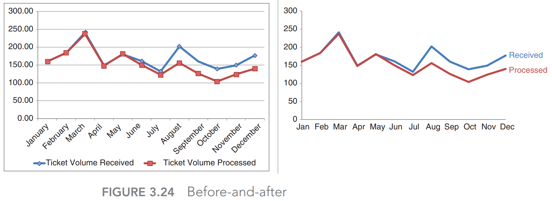
Clutter is your enemy: ban it from your visuals
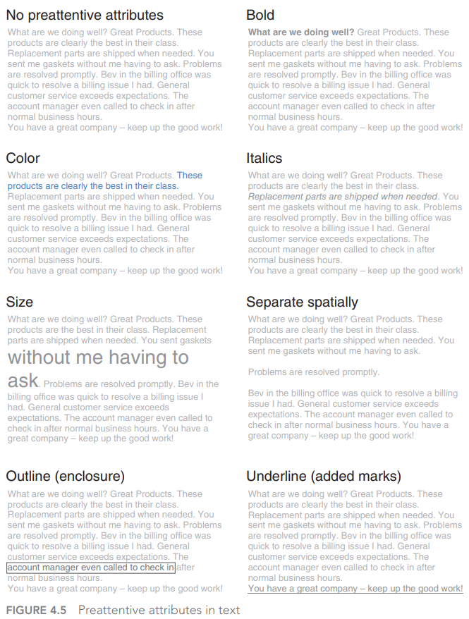
Preattentive attributes
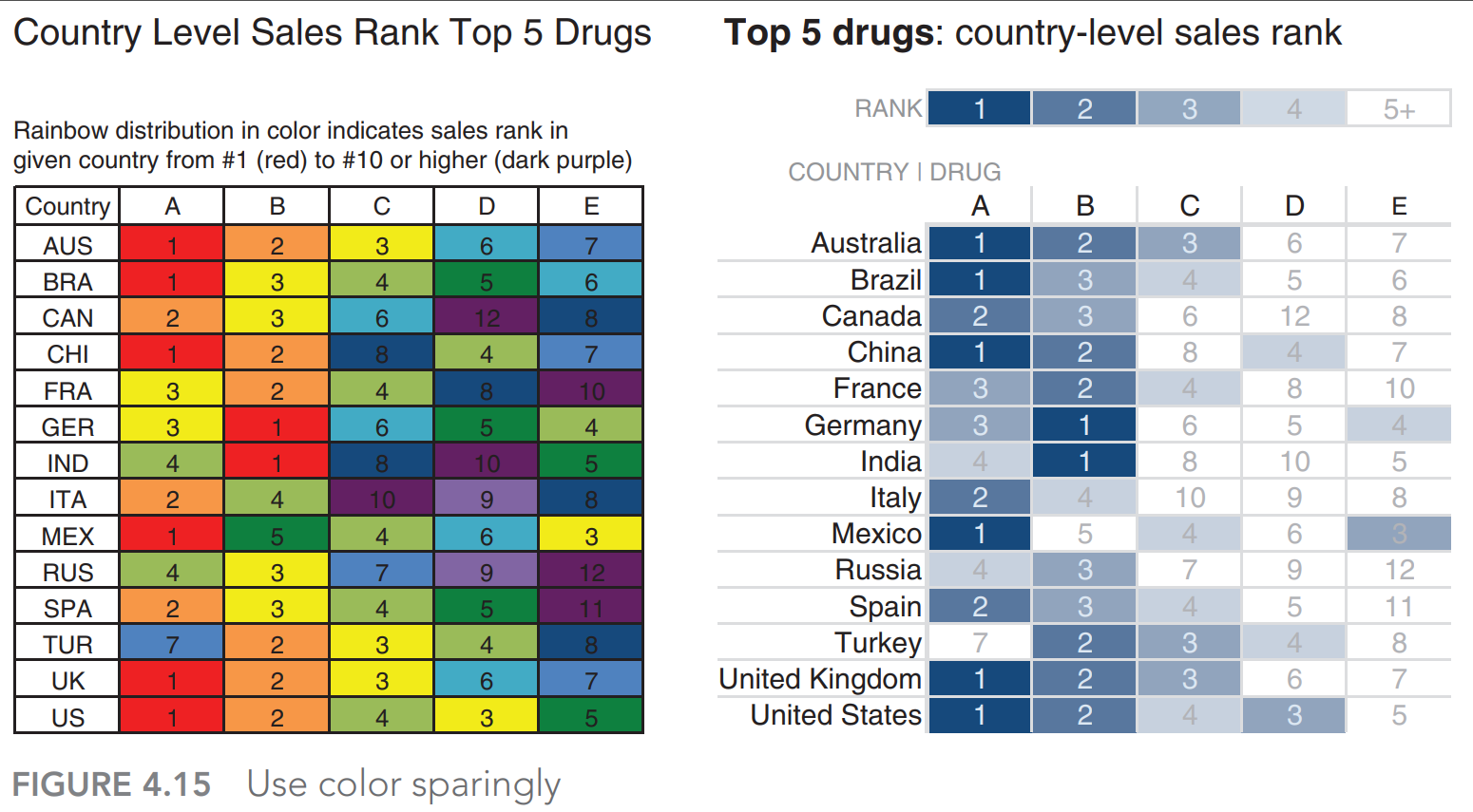
Use color sparingly
Focus your audience’s attention where you want them to pay it
Highlighting the important stuff and eliminating distractions,
Aesthetic design
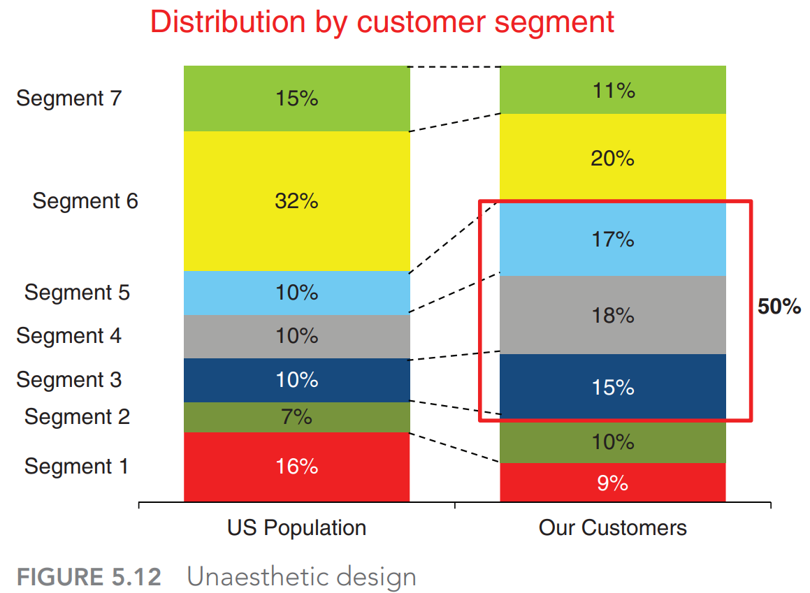
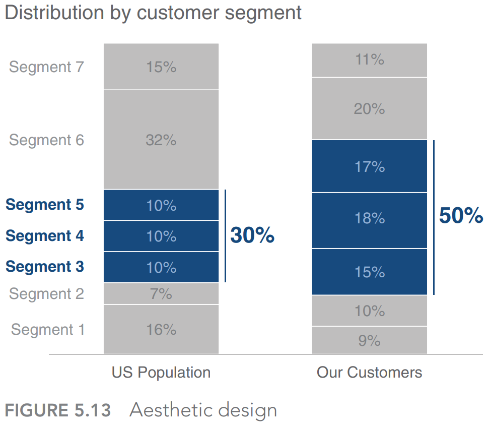
Red is used as the single attention‐grabbing color
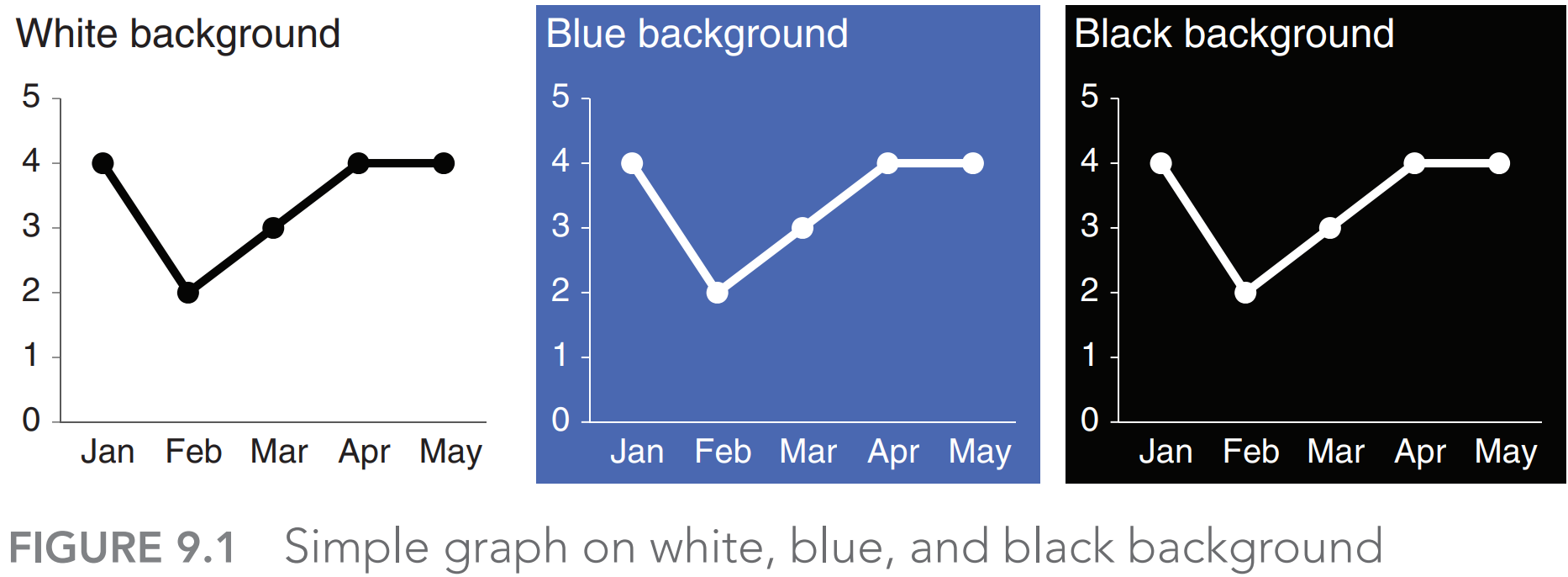
White background: Easy to focus on data
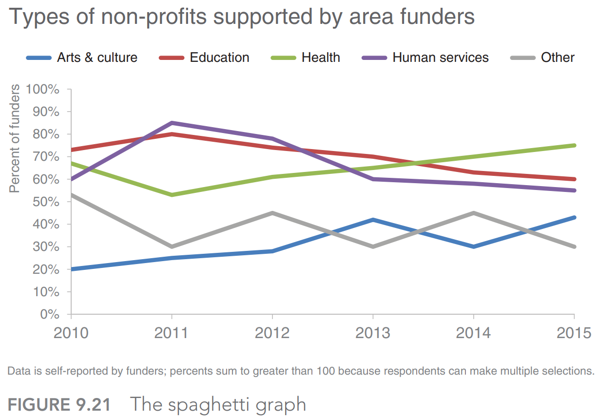
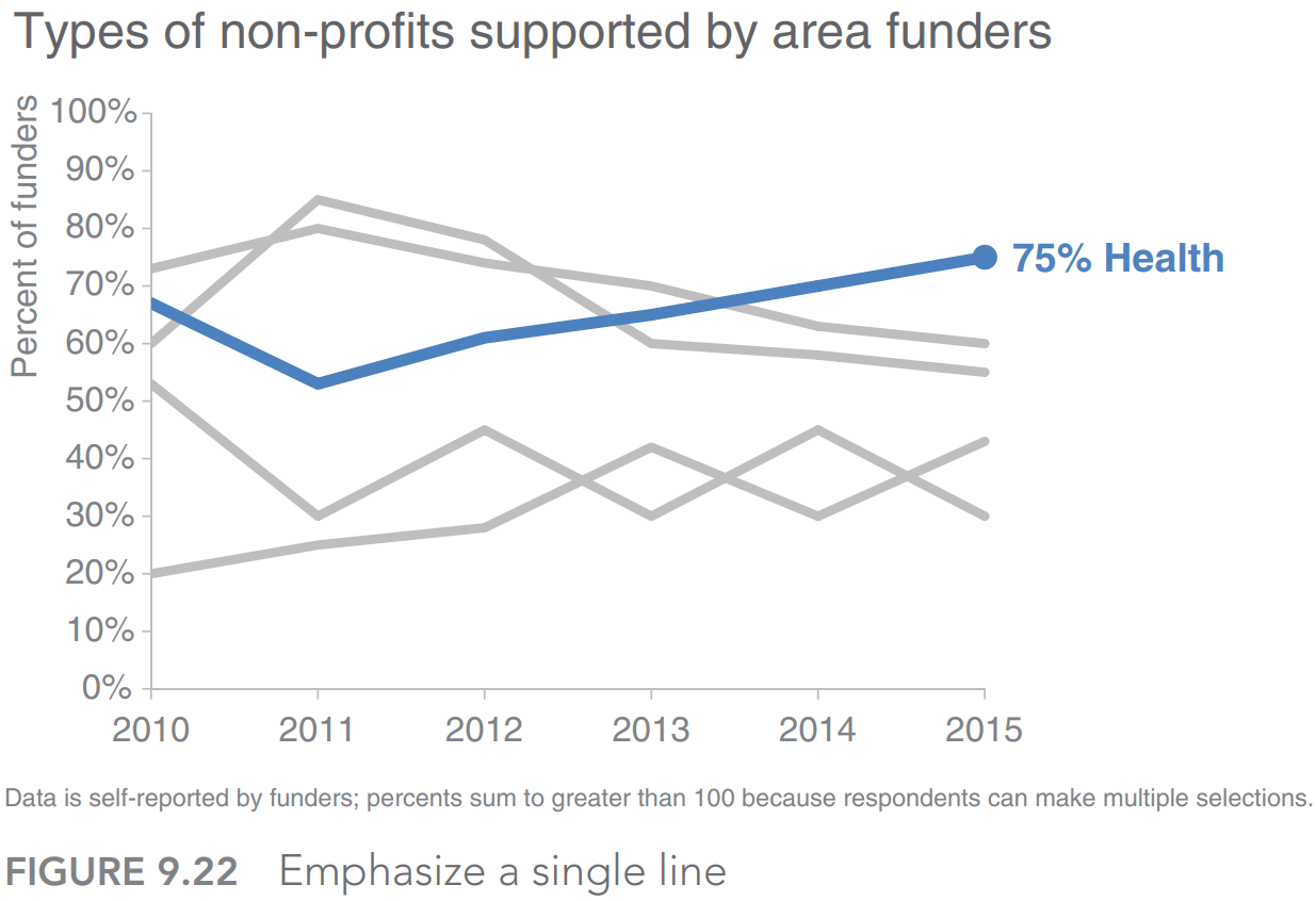
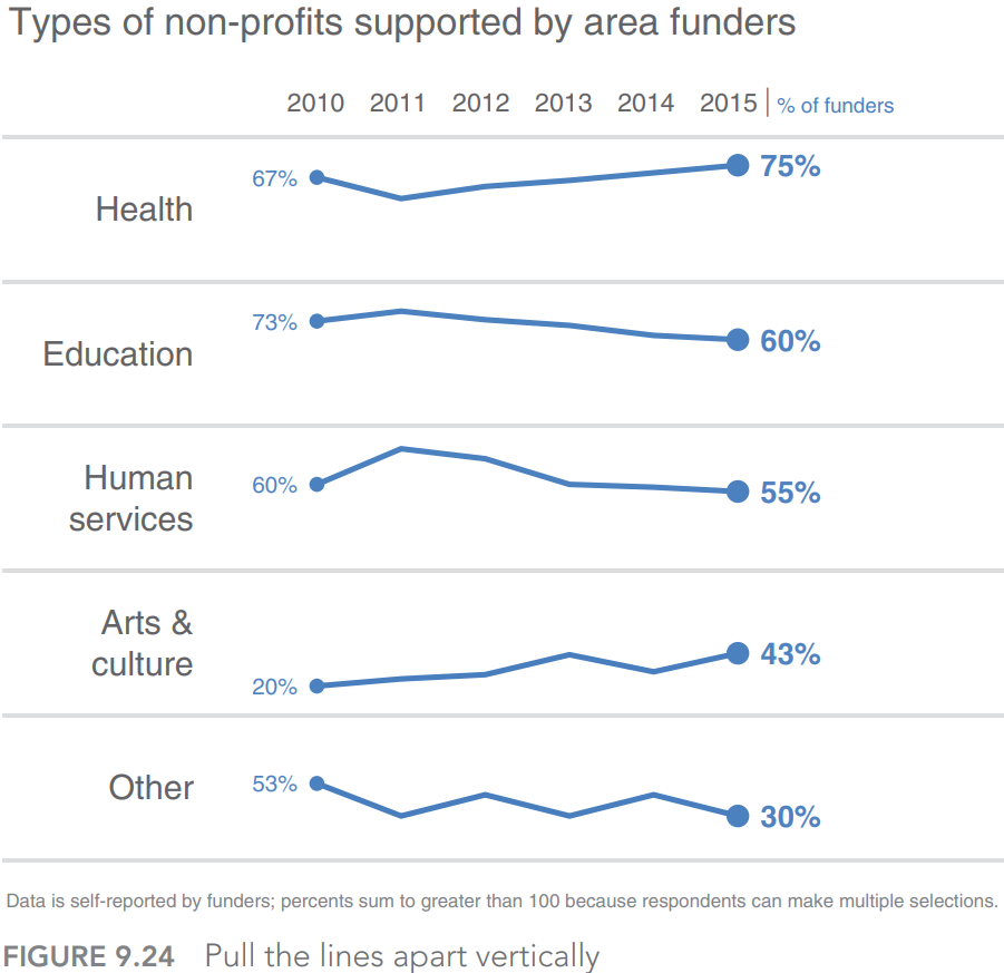
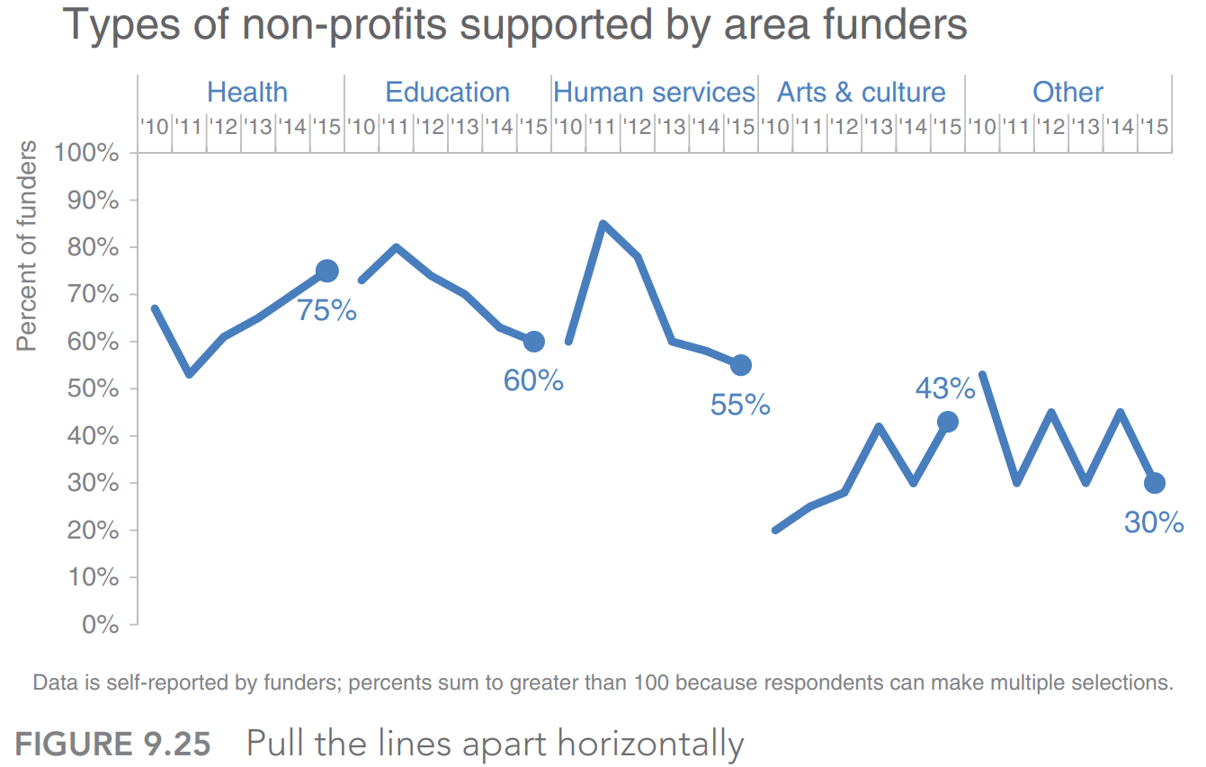
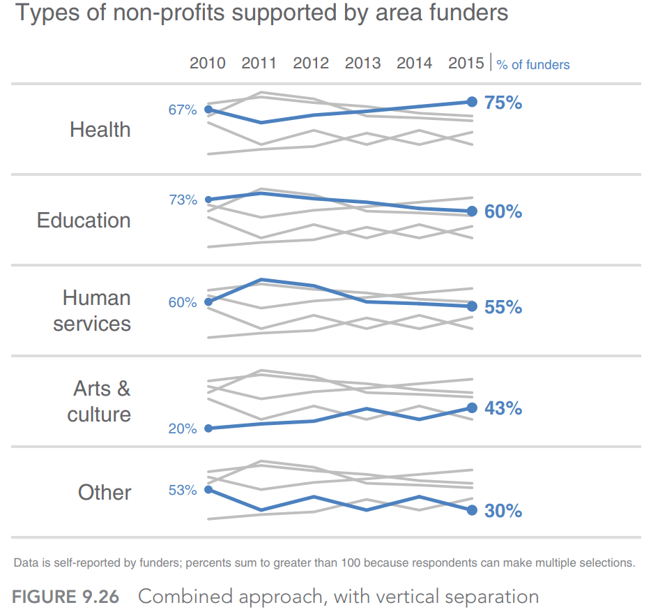
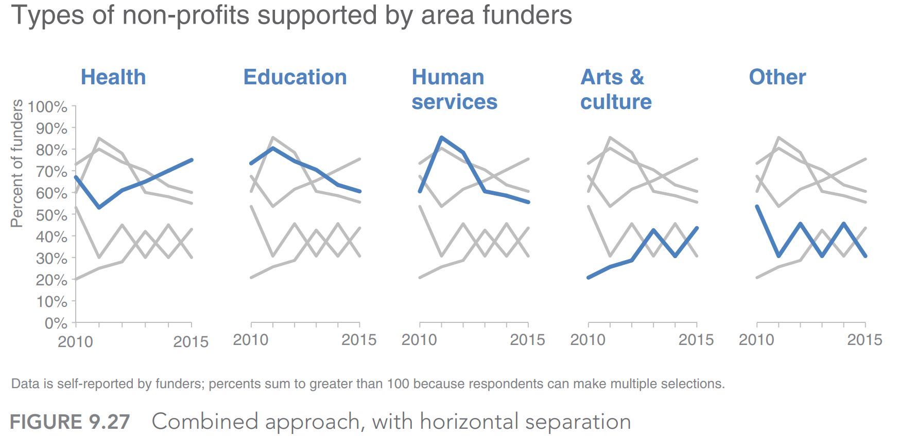
Strategies for avoiding the spaghetti graph
Spaghetti graph
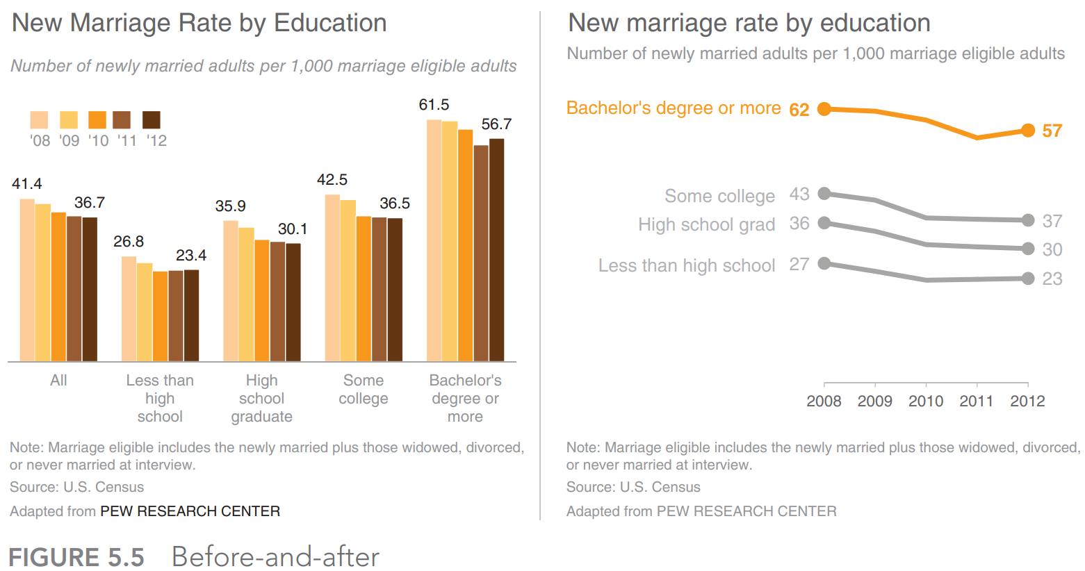
Emphasize one line at a time
Separate spatially
- Able to see the trend for a given category
- Comparing the values across categories
- Combined approach
Alternatives to pies
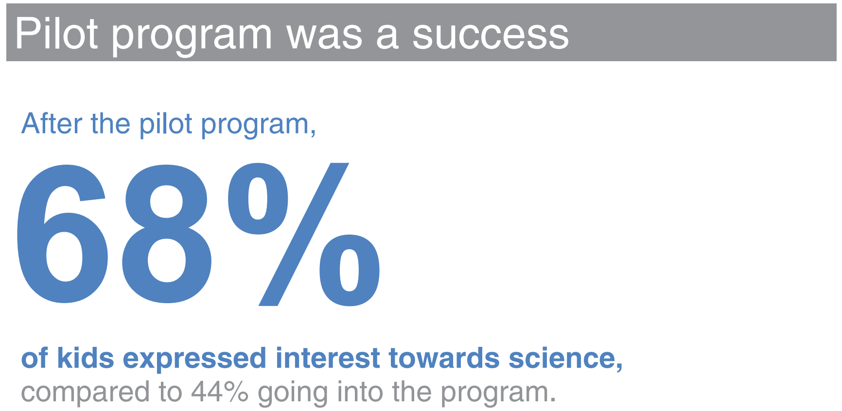
Show the numbers directly
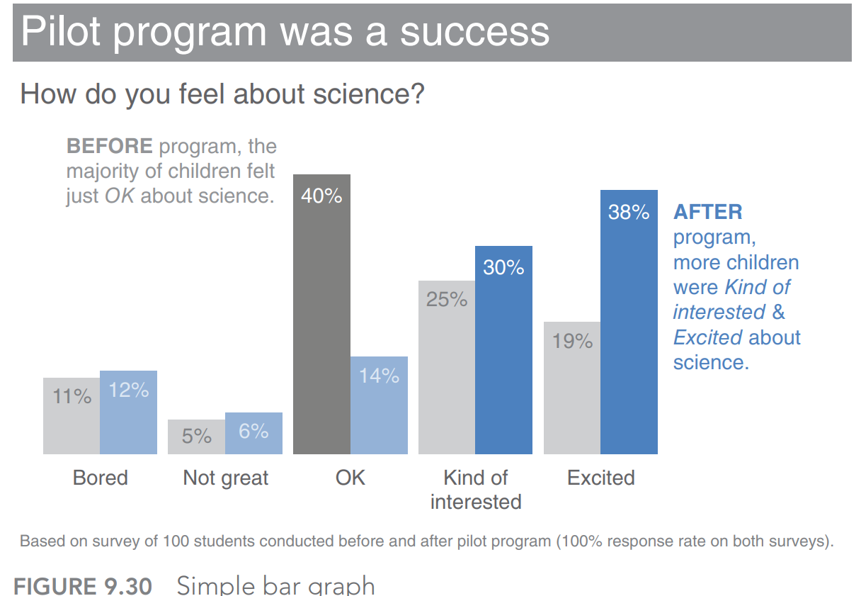
Simple bar graph
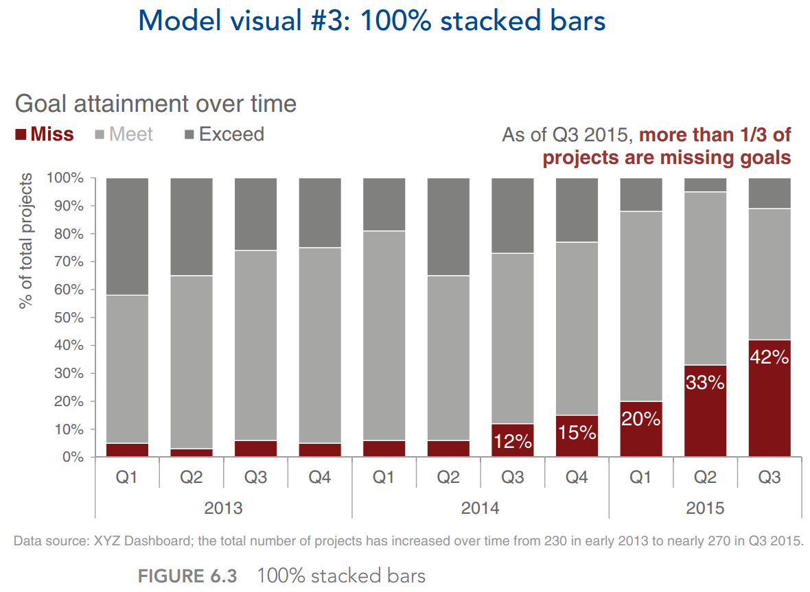
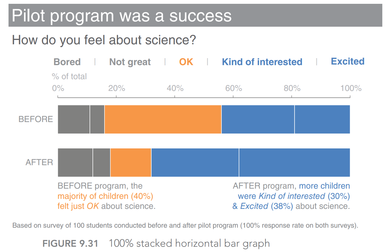
100% stacked horizontal bar graph
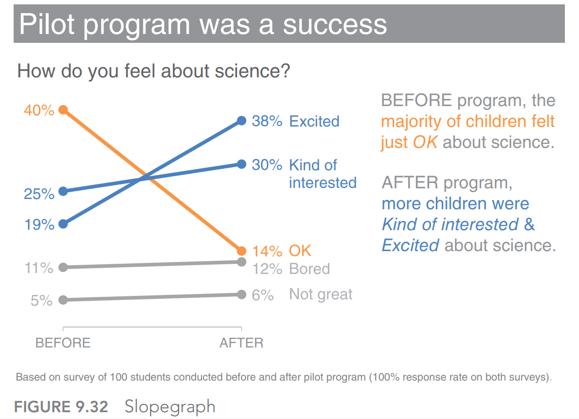
Slopegraph
Recap
Understand the context. Build a clear understanding of who you are communicating to, what you need them to know or do, how you will communicate to them, and what data you have to back up your case. Employ concepts like the 3‐minute story, the Big Idea, and storyboarding to articulate your story and plan the desired content and flow.
Choose an appropriate visual display. When highlighting a number or two, simple text is best. Line charts are usually best for continuous data. Bar charts work great for categorical data and must have a zero baseline. Let the relationship you want to show guide the type of chart you choose. Avoid pies, donuts, 3D, and secondary y‐axes due to difficulty of visual interpretation.
Eliminate clutter. Identify elements that don’t add informative value and remove them from your visuals. Understand how people see and identify candidates for elimination. Use contrast strategically. Employ alignment of elements and maintain white space to help make the interpretation of your visuals a comfortable experience for your audience.
Focus attention where you want it. Employ the power of preattentive attributes like color, size, and position to signal what’s important. Use these strategic attributes to draw attention to where you want your audience to look and guide your audience through your visual. Evaluate the effectiveness of preattentive attributes in your visual.
Think like a designer. Offer your audience visual affordances as cues for how to interact with your communication: highlight the important stuff, eliminate distractions, and create a visual hierarchy of information. Make your designs accessible by not overcomplicating and leveraging text to label and explain. Increase your audience’s tolerance of design issues by making your visuals aesthetically pleasing. Work to gain audience acceptance of your visual designs.
Tell a story. Craft a story with clear beginning (plot), middle (twists), and end (call to action). Leverage conflict and tension to grab and maintain your audience’s attention. Consider the order and manner of your narrative. Utilize the power of repetition to help your stories stick. Employ tactics like vertical and horizontal logic, reverse storyboarding, and seeking a fresh perspective to ensure that your story comes across clearly in your communication.